
Classic Wedding details like flowers and script always make for a pretty design! Laura knew she wanted something classic, but we made it new and fresh with a grey and gold color palette and blind embossed details. We created a debossed flower frame for the invite and RSVP and did all the text details in gold foil. It's one of those designs that makes you want to look closer to see all the pretty pressed flowers. The color combo really helps give it a modern romantic feel.


Paint Splatter Wedding Invitations

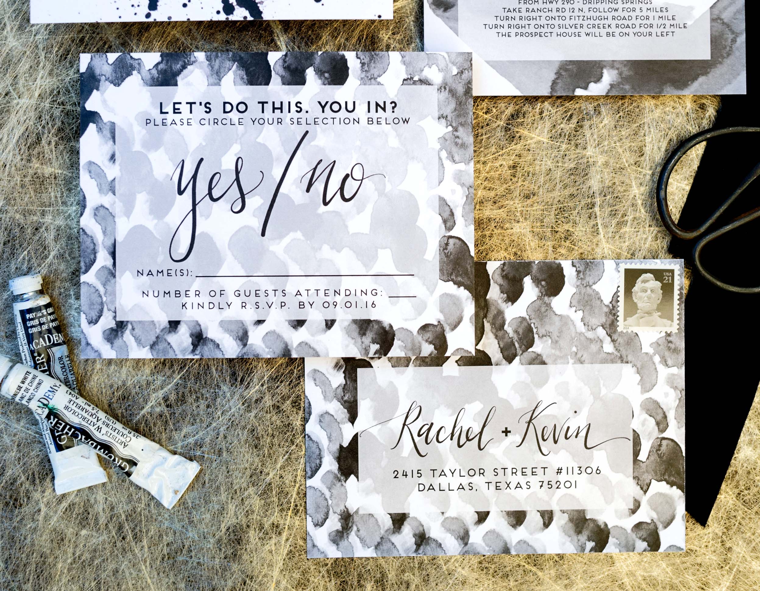
I love when you get a couple who wants to do something really different. Rachel and Kevin got married at a lovely and different modern venue and being a fun and modern couple, they wanted to have something creative and cool. I created a series of black painted repeat patterns to use on the different pieces of the wedding invitation, mixed with modern calligraphy and a vellum envelope for a sneak peek of the suite! My favorite bit is actually the RSVP, so fun!


Tropical Watercolor Wedding Invitations

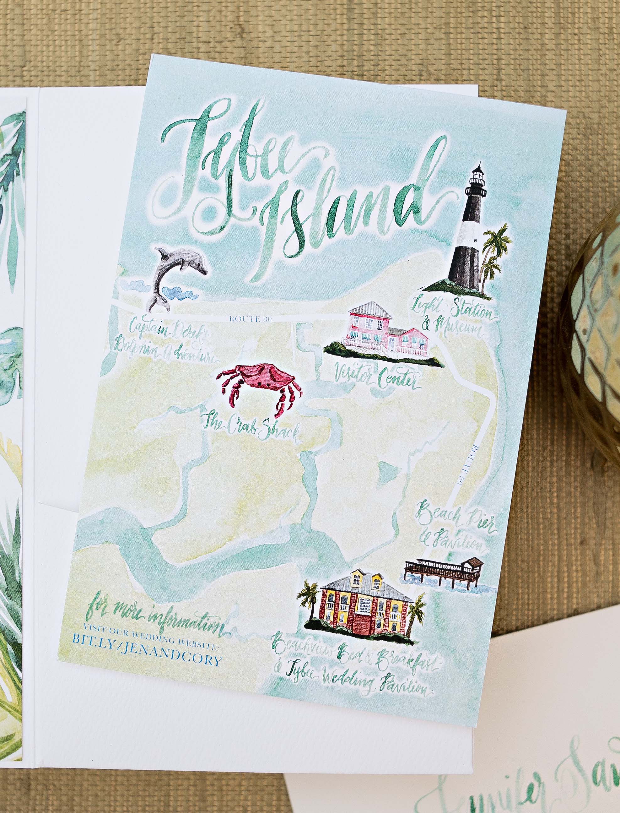
When I first spoke to Jen about her wedding vision, we were talking about fall colors and sunflowers. Then, as sometimes things do, everything changed! They moved up their wedding date and changed the location to a lovely tropical island in Georgia. So I hand painted a slew of tropical leaves to create a bright fresh tropical look. I had the envelopes printed with a green watercolor wash and then did the blue calligraphy addresses on top for another special touch. The watercolor map of Tybee is also one of my favorites, with the little custom painted icons of the different main island locations. I just love how crisp and pretty it is!


Blind Emboss Wedding Invitaitons

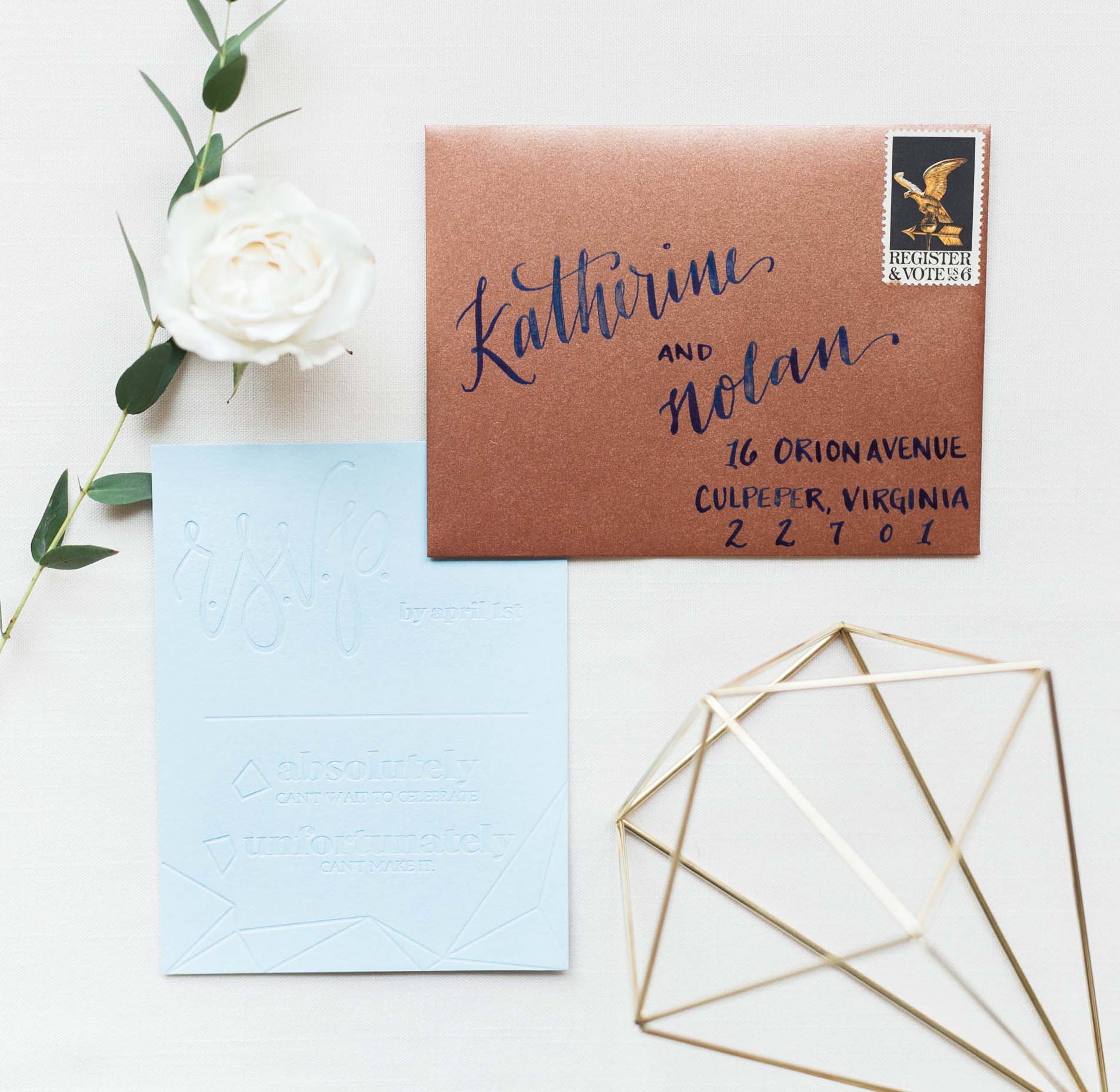
This past spring I took part in a wedding photo shoot we called "Written in the Stars" it was published on Style me Pretty, you can check out the whole shoot and the players here . I knew we'd be using some lovely geometric elements as a nod to constellations, and I wanted to do something a bit different with an entirely blind embossed design on colored papers with copper accents. What do you think?


Navy and Gold Nautical Wedding Invitations

Sometimes you get to take elements you've designed previously and re-imagine them for a new couple and a new design. The irregular foil dot is one I created for the Industrial Modern Save the Dates, Kate and Chris wanted something modern with a nod to their nautical wedding local and we thought we might be able to use that dot detail in a new way. When using foil on an invitation, I have a few existing foil plates (see this blog post to learn more about the foil process) which can be used to cut the cost of the beautiful detail as you are only paying for the application, not the creation of a new plate. So by mixing modern calligraphy, watercolor details and some pretty gold accents, we've come up with something new and lovely!


